
Overview
This project creates a graphical view of a Stars Temperature versus the Radius of said star. I am a big astronomy fan and wanted to use Data science to see scientific connections. The code will be placed at the bottom of the page. I did not create a GitHub Repo for it.
Technology
This project uses Python, Numpy, Pandas and Matplotlib. The data came in CSV form. I needed to parse it using Pandas and Numpy. This was necessary to do any calculations for the graph. I wanted the graph to also show the color of the star. This helps demonstrate how color affects the temperature.
Results
The results are here, placed in a scatter plot.
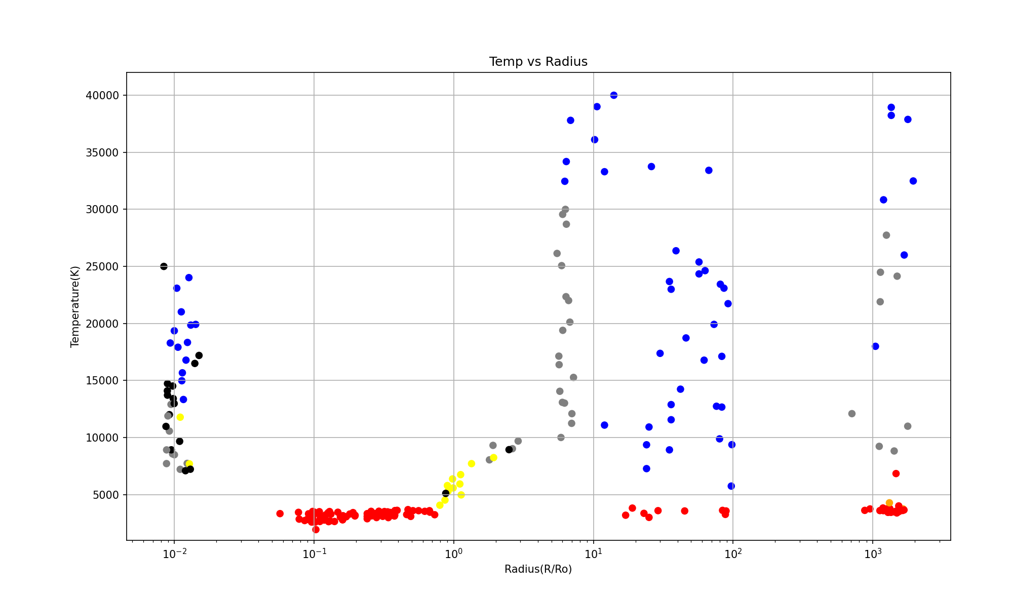
This graph shows that the size and color of the stars are for the most part, clumped with similar colors. There are exceptions and the Data needs to be cleaned to fix any outliers or placement errors.
Code
import pandas as pd
import matplotlib.pyplot as plt
import numpy as np

# Load in the csv of the star data
star_data = pd.read_csv('stars.csv')
# Turns the csv into a DataFrame from pandas
pd_star_data = pd.DataFrame(star_data)
# Sets the dataset to only the Temp, Radius, and Color
pd_star_TRC = pd_star_data[['Temperature','R', 'Color']]

# star_size = pd_star_data['R']
# Empty list for adding colors of star
star_color = []

# numpy calculations here for ease of access
median_star_temp = np.median(pd_star_data['Temperature'])
mean_star_temp = np.mean(pd_star_data['Temperature'])
diff_between_mean_median_temp = mean_star_temp - median_star_temp


# Gives the colors to each type for the plot
for lab, row in star_data.iterrows():
    if row['Color'] == 'Red':
        star_color.append('red')
    elif row['Color'] == 'Blue':
        star_color.append('blue')
    elif row['Color'] == 'White' or row['Color'] == 'Whitish' or row['Color'] == 'Blue white' or row['Color'] == 'Blue-white':
        star_color.append('gray')
    elif row['Color'] == 'Orange':
        star_color.append('orange')
    elif row['Color'] == 'Yellowish' or row['Color'] == 'yellowish' or row['Color'] == 'yellow-white' or row['Color'] == 'Yellowish White':
        star_color.append('yellow')
    else:
        star_color.append('black')


# Sets the output windows size
plt.figure(figsize=(14,8))

plt.scatter(pd_star_TRC['R'], pd_star_TRC['Temperature'], c=star_color)

plt.xscale('log')

plt.grid()
plt.ylim((1000, 42000))
plt.ylabel('Temperature(K)')
plt.xlabel('Radius(R/Ro)')
plt.title('Temp vs Radius')
plt.show()

print(pd_star_TRC)

print("The median star temperature is: " + str(median_star_temp) + "K")
print("The mean star temperature is: " + str(mean_star_temp) + "K")
print("The difference between the mean and median star temperatures is: " + str(diff_between_mean_median_temp) + "K")

Leave a comment